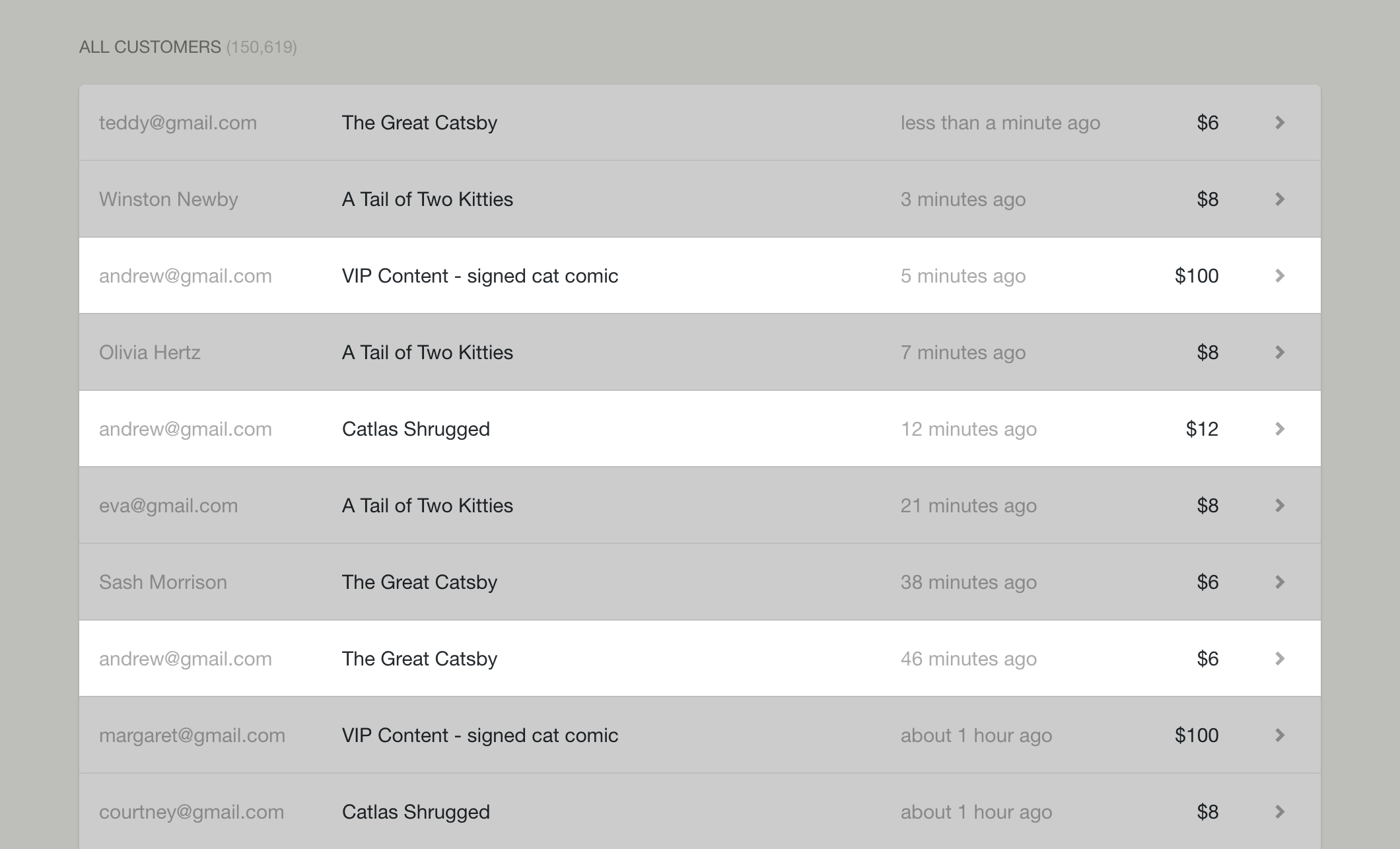
Let's jump in — you’ve posted your books on Gumroad, held your breath while tweeting the link out, and you're seeing sales come in from your audience. Now cue the celebratory dance in your computer chair. You log in to Gumroad and see all of these new customers, but at this point, you're staring at your screen thinking...
Who are my top customers?
Which customers have spent the most?
How many times has a certain customer purchased from me?
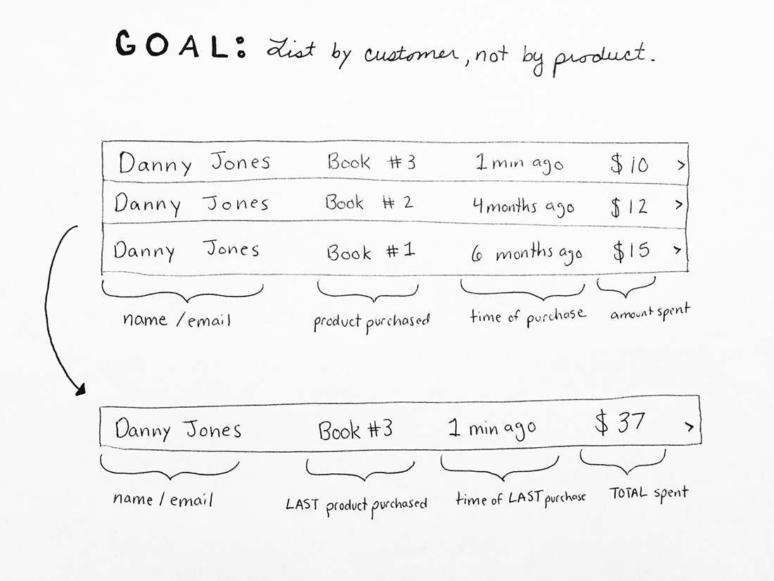
The problem is that you can't answer any of these questions in the current design. It's simply a list of purchases, with no aggregated information about customers.
Information about the customer and the purchase is repeated each time.
If a customer writes in asking for a receipt, the creator must then go and search for that individual purchase, rather than just find the customer and see a summary of their purchases.
Since Gumroad has focused on helping creators
build out their audience, it’s important that we help creators understand who their most engaged fans are.
Research
We already knew that creators had been requesting better ways to manage and understand their customers. I talked with our support person to learn more about these requests and any current confusion on this page. Here are some findings:
The customer list takes a while to load if you have thousands of customers.
It requires some digging to find specific purchases from a customer.
Creators want to manage all receipts, refunds, and subscriptions for a customer within one view.
It's important to note that creators choose to use Gumroad because we let them own the customer relationship. Nathan Barry, a Gumroad creator, explained in an interview his reasoning for choosing to put his products on Gumroad.
I often get asked why I, as a full-time author, don't sell my books on Amazon or the iBooks store. The biggest reason is the lack of customer information. I want to sell directly to my customers so that I can email them to ask how they like it, know who is buying it and where, and be able to build on that relationship to make my next book launch more successful than the last.
— Nathan Barry, author on Gumroad
Your customers are your business,
so we want to help you understand who they are.
Sketch
I broke this up into thinking about it first for the main customer page, then for the customer drawer.
Customer Page
Putting the focus on the customer, not the transaction. Determining what information to show now that purchase entries are being consolidated to one customer entry.
Customer Drawer
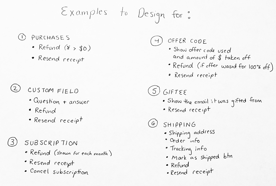
Laying out all examples that need to be designed for, and the accompanying purchase information or actions that need to go with it (i.e. refund, resend receipt).
Design
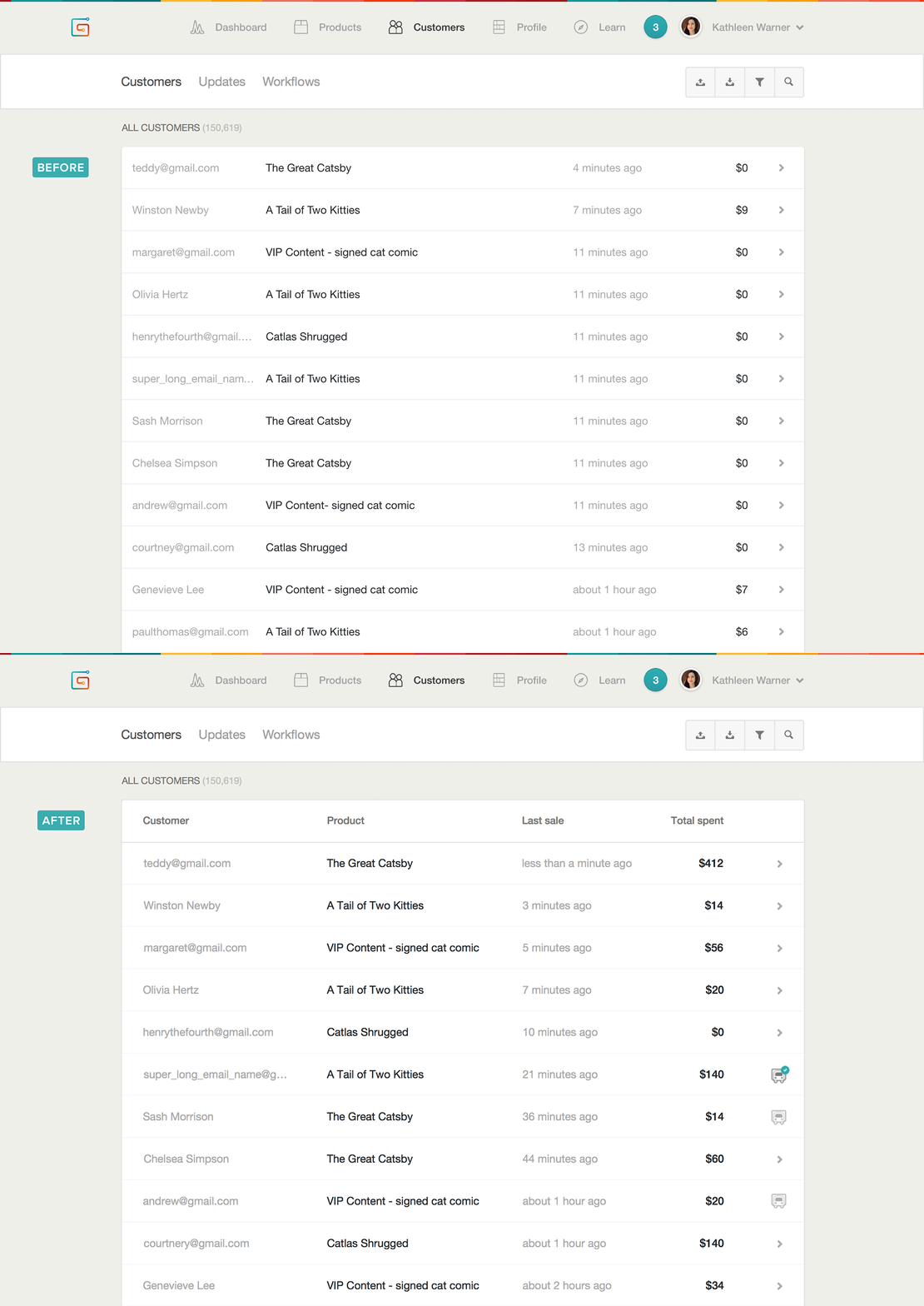
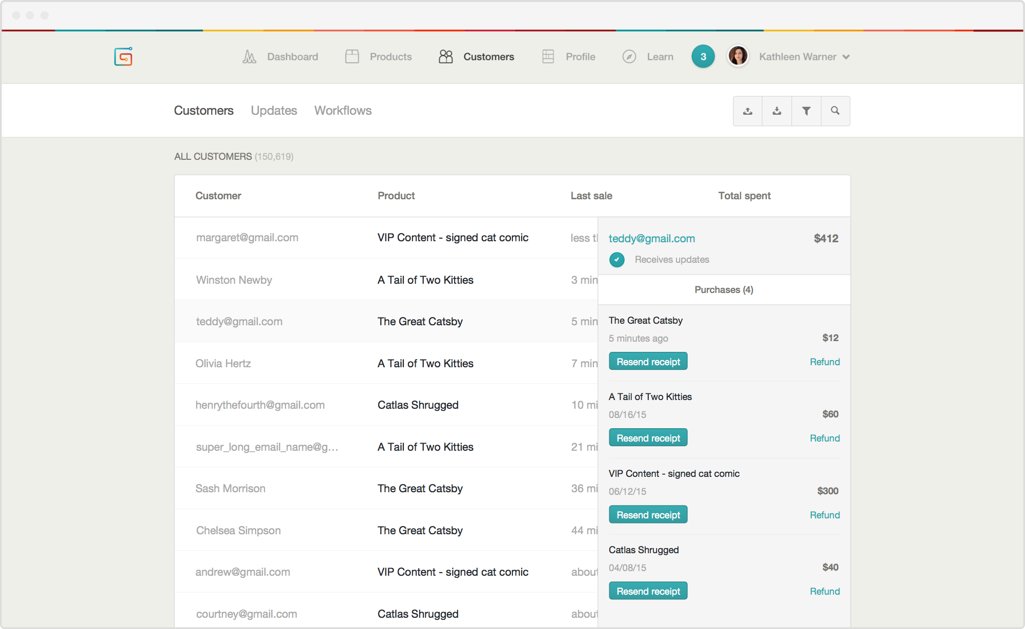
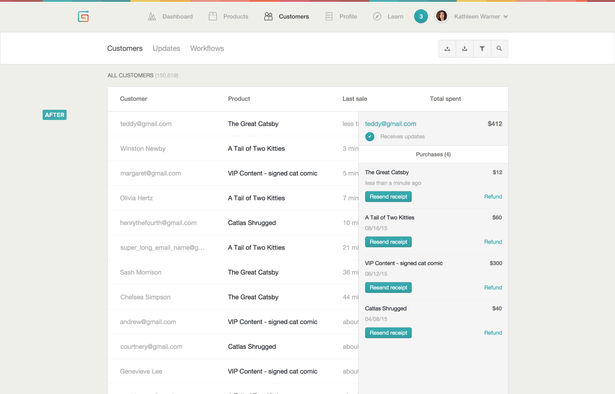
Below is the final design. I put focus on listing customers once and highlighting the total that they've spent, then added column titles to clarify what's shown.
There were also some column width problems I wanted to fix with the changes.
One thing I considered was putting the number of purchased products in this column instead of the name of the last purchased product.
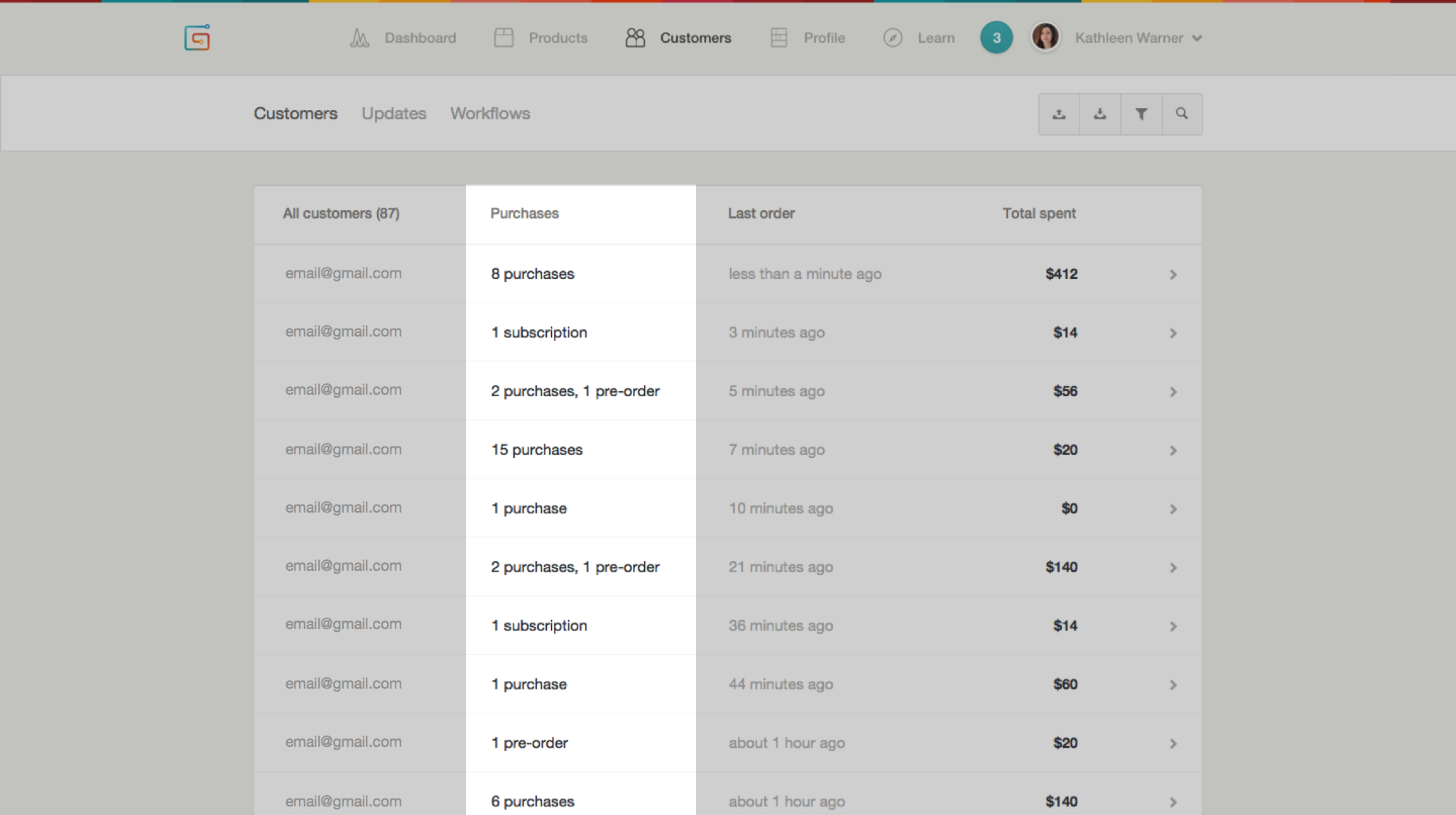
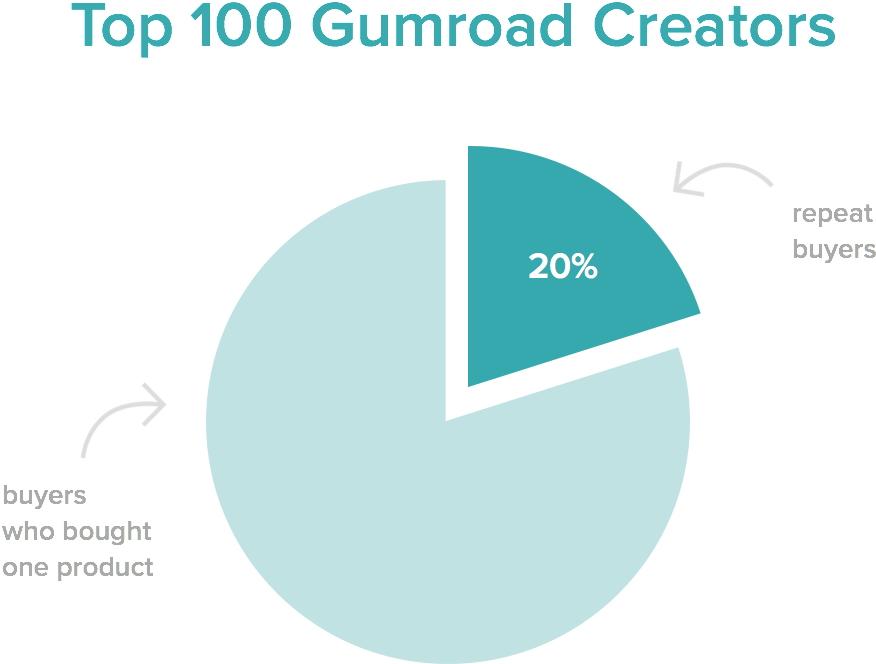
I ended up deciding against this because it meant the creator wouldn't be able to scan this list and get a sense for what's currently being purchased. Though it would add some value to show how many purchases a customer made, this would only be a design worth pursuing if the majority of an audience purchases more than one thing. In most cases, this would show just "1 purchase". Let's check this assumption with some data from the Top 100 Gumroad creators.
Now let’s move on to purchases within the customer drawer. Originally, purchases were not all shown together for a
customer. They were listed separately, each in their own row. This created confusion for creators when they had to scan
for a purchase from a customer, and find the specific one that the customer may be emailing in about.
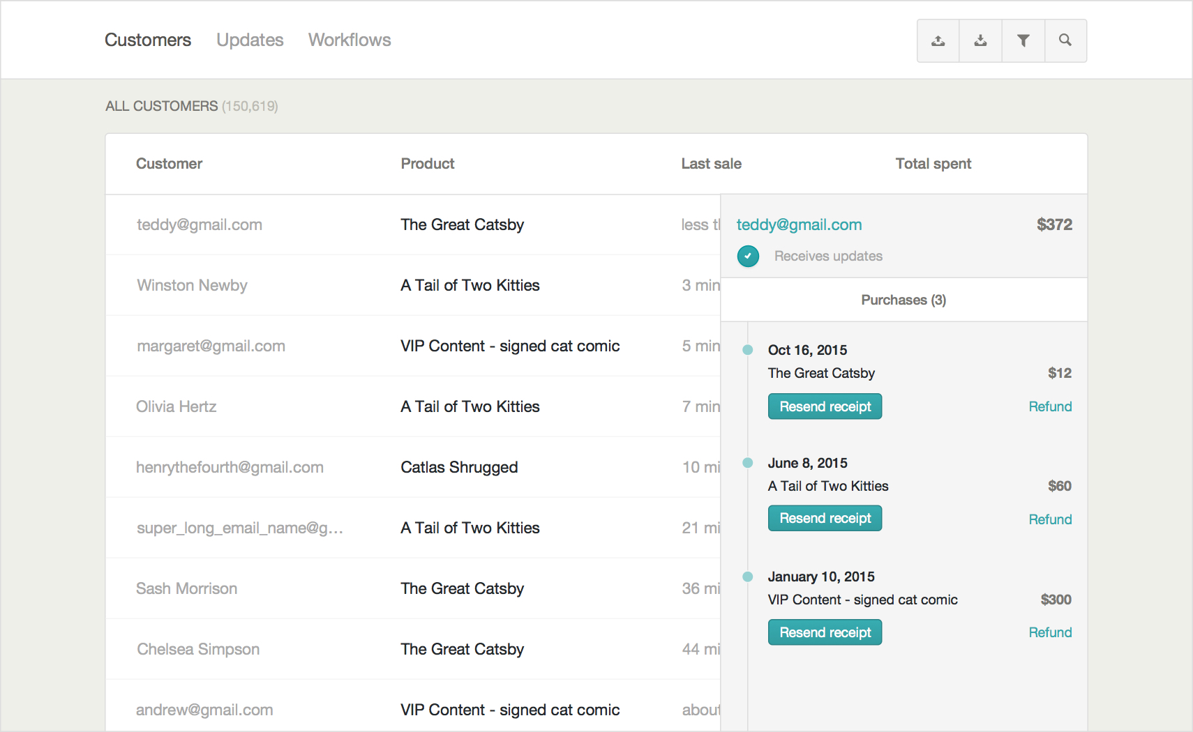
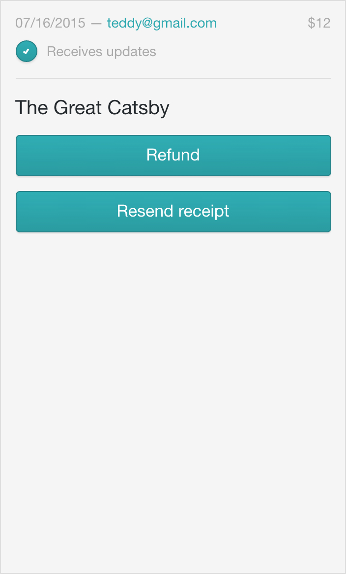
One note about this design --it’s easy to accidentally click Refund instead of Resend receipt (which are very different
actions!). I made sure to separate out these buttons in the next design, and put less emphasis on Refund.
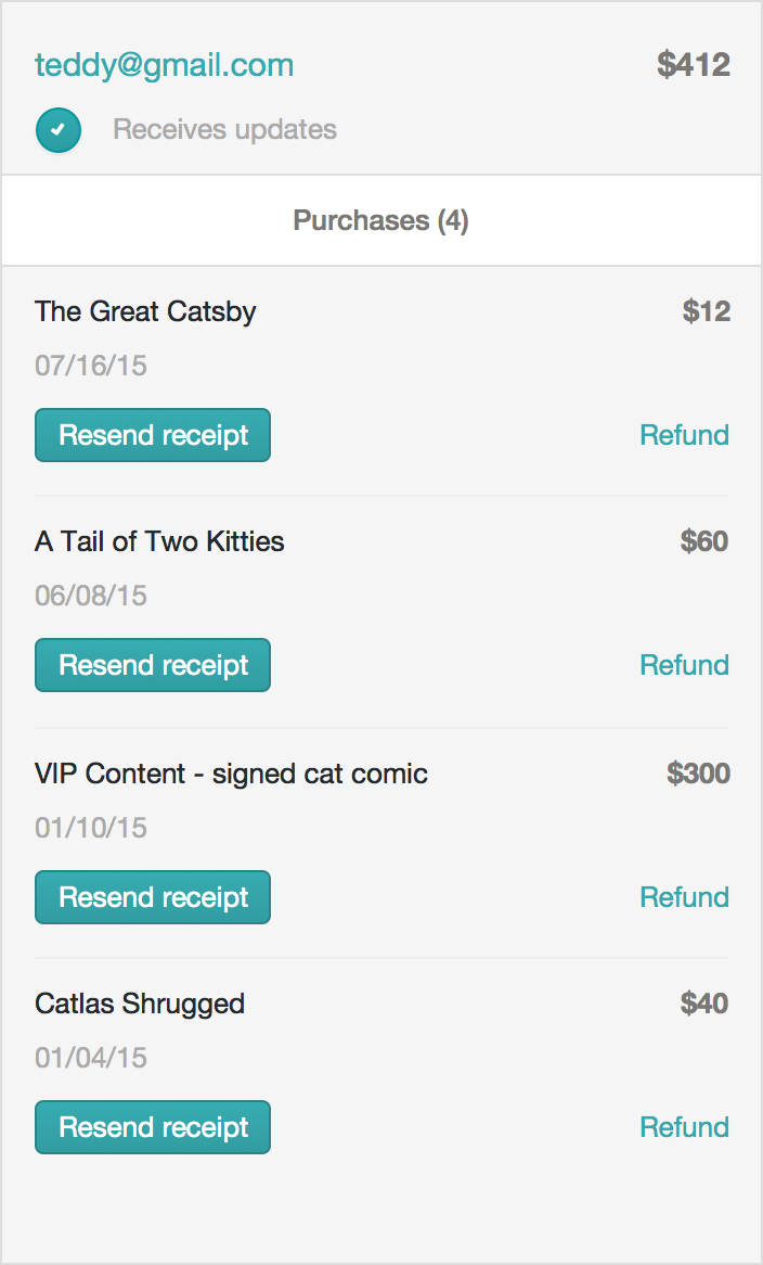
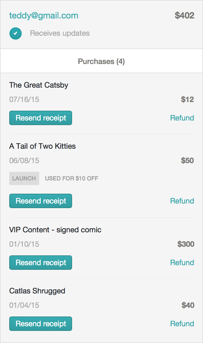
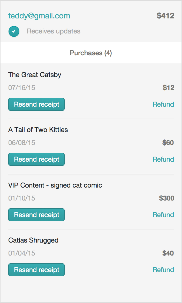
Now designed to have all purchases within the same customer drawer.
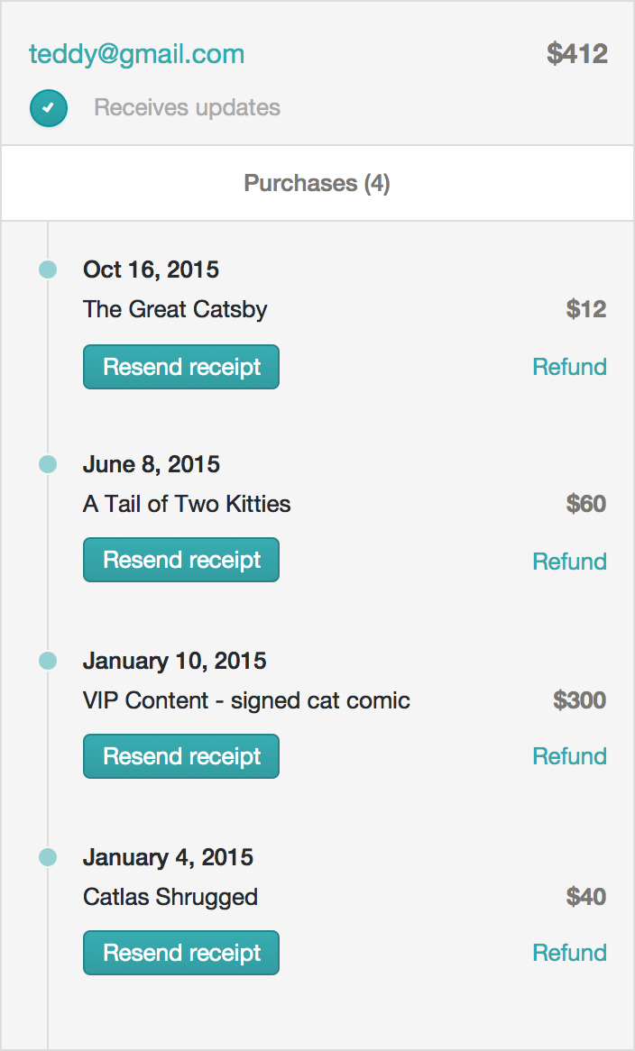
I explored the idea of having the customer drawer show a timeline of purchases, to help the creator understand the
relationship from the start to present. I liked that this exploration showed more of a narrative between the creator
and consumer, instead of a list of transactions.
Here’s a side by side comparison of the two designs. The left design emphasizes the product purchased, while the right design emphasizes the timeline of purchases.
I ended up deciding against this design after talking with creators and learning that they mostly used this view when they needed to send receipts, issue refunds, or perform other operational tasks. With this in mind, the narrative of the
timeline seemed more like a distraction, preventing the creator from quickly finding the purchased product and taking action on it.
Now that the direction of the design has been decided on, here are a few instances that need to be
designed for within the customer drawer.
Purchases
Information to display:
Refund
Resend Receipt
Things to keep in mind:
Show amount spent and time purchased
per product now that all products are
within one view.
Separate out Refund and Resend receipt,
so they’re not accidentally clicked.
Put more emphasis on Resend receipt
than refund.
Before
After
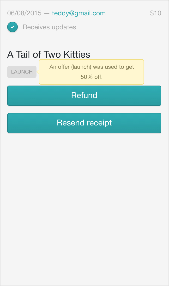
Offer Code
Information to display:
Offer code used
Refund
Resend receipt
Things to keep in mind:
Show the amount the customer
received off next to the offer code,
instead of on hover, as it is now.
Before
After
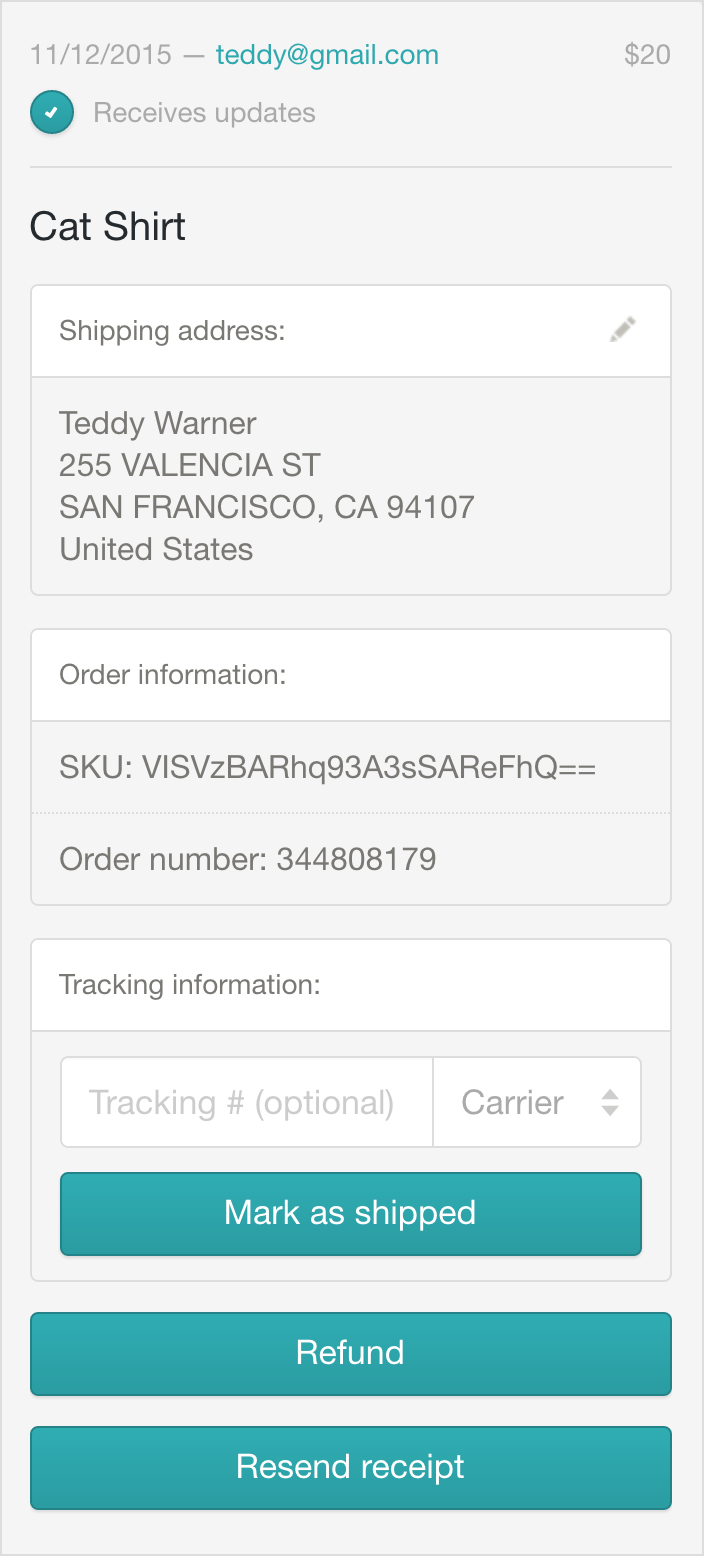
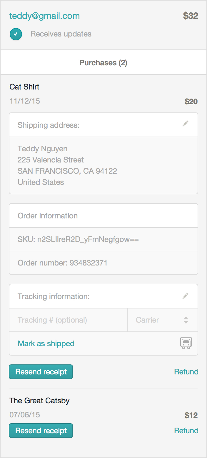
Shipping
Information to display:
Shipping address
Order info
Tracking info
Mark as shipped button
Refund
Resend receipt
Things to keep in mind:
The smaller text, buttons, and rows will
help clean this up.
Before
After
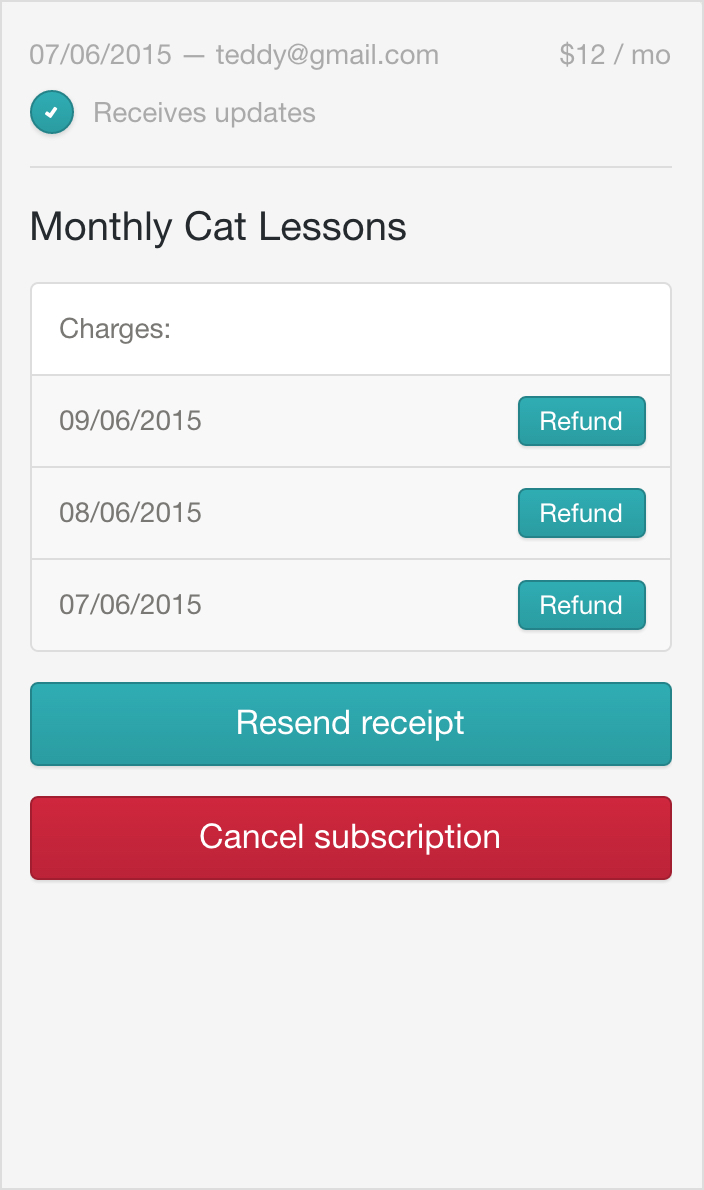
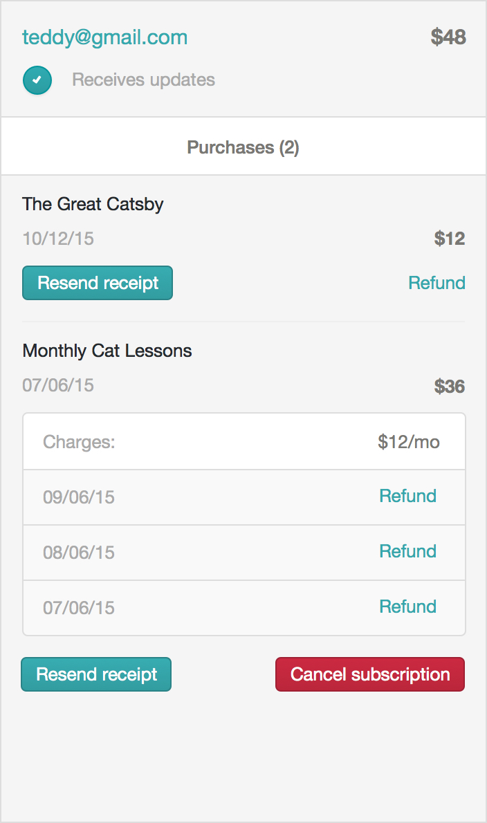
Subscription
Information to display:
Cancel subscription
Charges
Refund
Resend receipt
Things to keep in mind:
Show the charges and refund button at
the monthly level.
Before
After
Future
This is beyond the scope of this project, but in the future
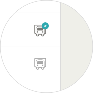
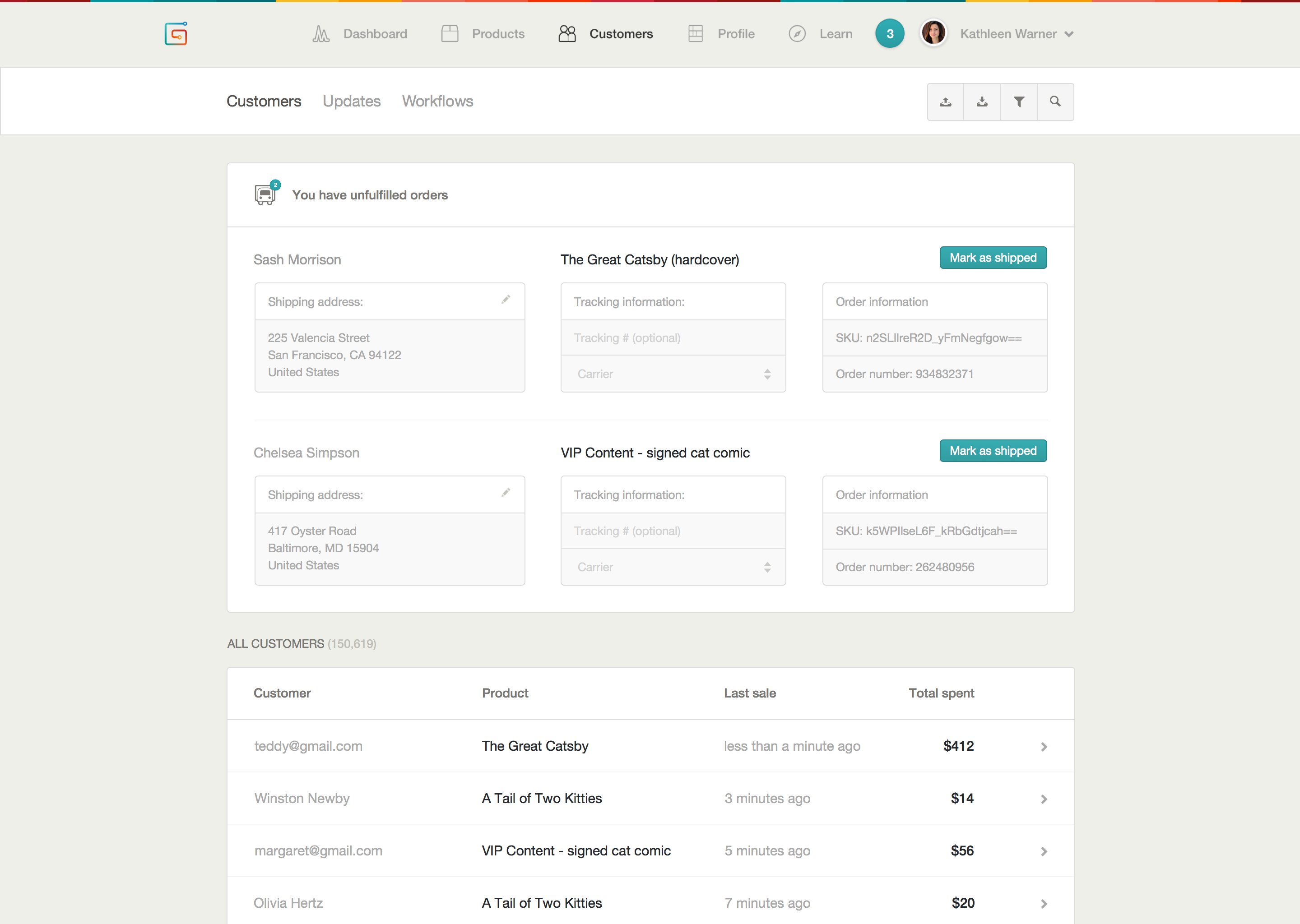
we could help creators manage their shipments. While working on these designs, I realized how difficult it can be for creators with larger audiences to manage their shipments. Imagine being a band with thousands of followers, and posting new merch on Gumroad. Then as hundreds of orders come in within hours, you have to search for these orders within the customer list and make sure they're shipped.
Instead of having to scan your customer list to see which orders are unfulfilled,
these unfulfilled orders could appear up top.