I worked on the redesign of the Sesame iPhone app and the launch of the Sesame iPad app.
Sesame is an app that makes it easy to send personalized gift boxes to friends. I joined the team for a summer internship in 2014 and worked with one other designer and four engineers. Below are some of the things I worked on during that summer.
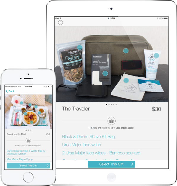
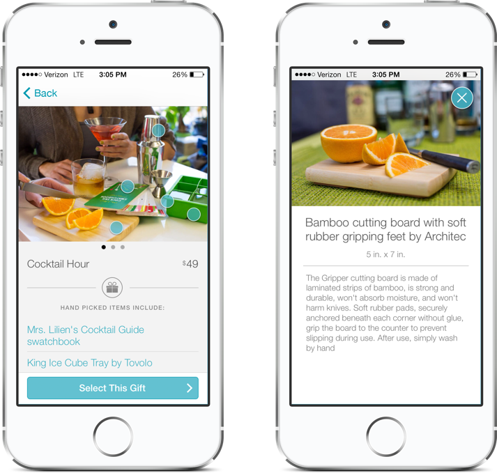
In the Product and Item detail screens shown below, we wanted to showcase each gift set and help users understand what it contains. In order to reduce the amount of information to show for each gift show, we mapped dots on each item to a modal with more information. This approach allowed users to have control over what they wanted to learn more about.
(Also credit to Khoi Tran)
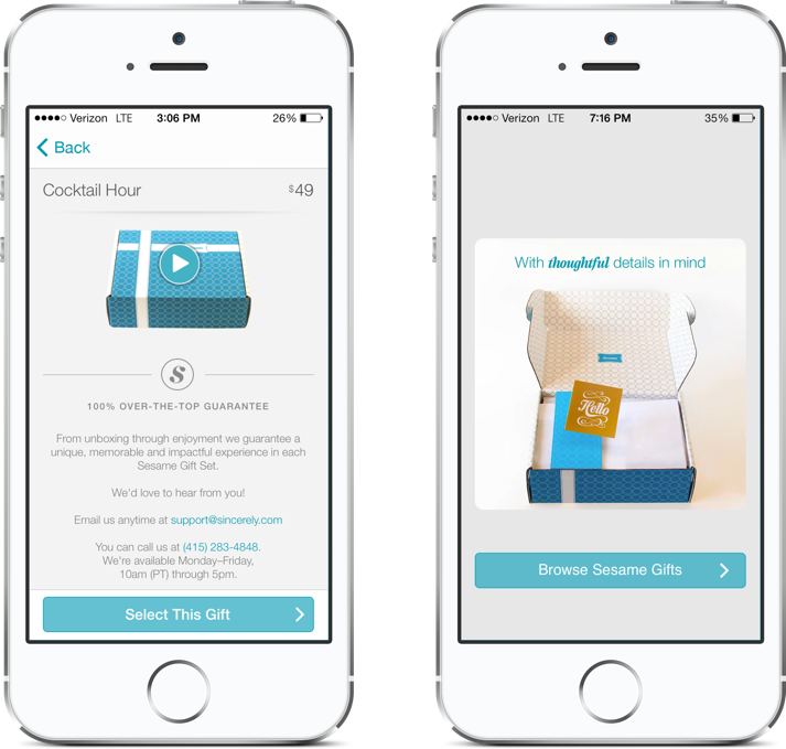
After reading through customer surveys and looking at funnel data in Mixpanel, I began experimenting with ways that we could improve our onboarding experience. We discovered that many users love our packaging and the assortment guides that we design for each gift set, but they didn’t experience this until they received a Sesame gift themselves.
I wanted users to see this experience, feel the excitement of gift giving, and imagine their recipient opening their present. After iterating through different onboarding experiences, I created a stop motion video that shows Sesame’s over-the-top unboxing experience.
Existing users now see this video within the product detail of each gift set (left screen) and new users see it as soon as they download the app (right screen).